You're Analyzing Survey Data Wrong. Here's How to Fix It.
Learn how to analyze a survey data accurately to uncover actionable insights. Boost your startup growth with honest, data-driven decisions. Click now!
Posted by
Related reading
Why Reputation Management Tools Matter More in 2025 Than Ever
Learn how reputation management tools help businesses track reviews, analyze feedback, and protect brand image. A modern guide with AI-driven insights using Backsy.
Sentiment Analysis Isn’t a “Nice-to-Have”. It’s a Lie Detector for Your Product.
Founders love chasing features, but customers speak in emotions. Learn what sentiment analysis really is, how it works, and how it reveals the truth behind your feedback. No fluff.
Customer Feedback Analysis: A No-BS Playbook for SaaS Founders
Stop guessing. This blunt guide to customer feedback analysis shows SaaS founders how to turn raw comments into roadmap decisions, retention wins, and revenue.
Let's be honest. That survey you just ran? It’s probably a pile of useless noise. You’re staring at a spreadsheet, patting yourself on the back for a decent Net Promoter Score while your churn rate quietly eats you alive.
Most founders treat surveys as a vanity project. A box to check. They aren't looking for truth; they're looking for validation. If you're not prepared to hear that your brilliant new feature is a dud or that your UI is a confusing mess, stop reading now. Real analysis is about finding the painful, expensive truths that save your business. It's about trading ego for evidence.
Ignore your customers, and you’ll be lucky to survive the quarter.
Step 1: Define Your One Brutal Question Before You Ask Anything
Before you write a single question, stop. What’s the fire you're trying to put out? Dismal trial-to-paid conversion? Churn rate looking like a slow-motion car crash?
"Running a survey" is founder malpractice. You anchor the entire effort to a single, brutal question you're desperate to answer. Everything else is noise. A good one sounds like this: “Why did our last 100 churned users really leave?” That’s a question with stakes. It forces you to stare an uncomfortable truth in the face. It’s not some vague, feel-good query like, “How can we improve?” which is a complete waste of everyone's time.
For a deeper look at this, check out this guide on the best questions to ask for customer feedback. If you can't articulate your hypothesis in one clear sentence, you're just making busy work and annoying the few people who still pay attention to you. To build questions that actually lead somewhere, look into proven models for sample evaluation questions that force clarity.
Takeaway: Stop making busy work and start hunting for evidence that answers one single, terrifyingly important question.
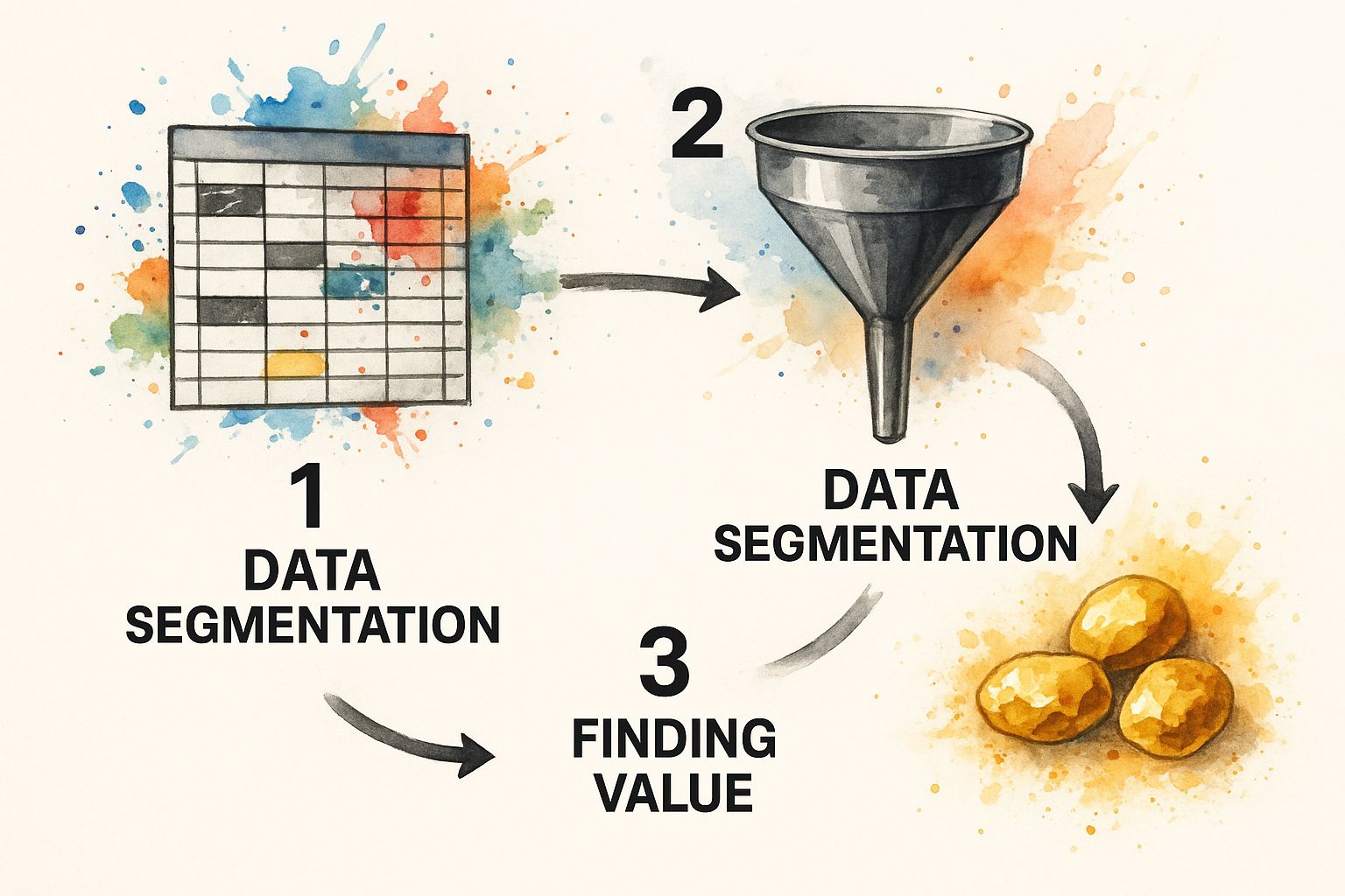
Step 2: Segment Your Data to Find the Gold (and Ditch the Garbage)
That CSV file you just downloaded is a mess. A jumble of numbers, angry rants, and polite non-answers. Trying to make sense of it in one go is like performing brain surgery with a soup ladle.
First, separate your data. Quantitative scores in one bucket, open-text feedback in another. Now, hunt down the garbage. Anyone who answered '5' to every question? Gone. Anyone who finished your 30-question epic in 45 seconds? Gone. This isn't data; it's pollution. Clean it out.
Now, segment. Stop looking at the "average" user—that person is a statistical myth that papers over the cracks in your product. Start cross-tabulating. Ask sharper questions:
- What do our highest-paying customers think versus free-tier users?
- How do users who have been with us for 3+ years answer compared to rookies?
- What's the difference between users who use Feature X daily and those who've never touched it?
This infographic breaks down the process—turning a chaotic mess into pure, actionable gold by applying a few smart filters.
Choosing the right model matters. To predict a score like customer satisfaction, use a multiple linear regression. To analyze a "yes/no" outcome like an upgrade, use logistic regression. You can explore more on statistical modeling for survey data.
Takeaway: Stop averaging and start dividing; the most expensive truths are found by comparing your best customers to your worst.
Step 3: Turn Angry Rants Into Your Product Roadmap
The numbers are easy. The messy, typo-ridden, open-text fields are where the real gold is buried. This is where customers drop the polite facade and give you the unvarnished truth. Don't you dare skim them for positive quotes to slap on your landing page.
You need to code them. Manually. It's tedious, and it's the most valuable work you can do this quarter.

Create 5-7 high-level buckets. Don't overthink it.
- Bug Report: "It's broken."
- Feature Request: "I wish it did X."
- Pricing Complaint: "This is too expensive."
- Confusing UI: "I couldn't figure out how..."
- Praise: The rare gems you'll be tempted to focus on. Don't.
Suddenly, you'll notice 30% of churned users mention the confusing onboarding. Boom. That's a data point. It's a flashing red light you’d be a fool to ignore. This isn't just a startup trick; the Gallup World Poll does this on a global scale. Also, hunt for emotional triggers. Words like "frustrating," "disappointed," and "finally" are pure gold. They tell you where the biggest friction is. This process is the foundation for any serious feature prioritization framework that isn't just you guessing in a conference room.
Takeaway: Stop looking for validation in the comments and start hunting for patterns in the pain; that's your roadmap.
Step 4: Translate Insights Into Action Without More Meetings
https://www.youtube.com/embed/DkIri3egB-4
You’ve sliced the data and coded the rants. If your next thought is scheduling a two-hour meeting, you've already lost. Insights die in forgotten PowerPoints. Your job isn't to present "findings." It's to present decisions.
Analysis without action is academic masturbation. Don't say, "25% of users find the dashboard confusing." Lead with the solution: "We're redesigning the dashboard next sprint based on these three complaints." One is a report; the other is a commitment.
Every insight must be paired with an owner and a next action. If you can't assign it, it's just trivia. Be ruthless. A feature request from a user who will never pay? Kill it. A pricing complaint from a low-value segment? Ignore it. Your deliverable is not a report. It's a short, brutal list of things you will build, fix, or kill. For more on this, there’s a great guide on how to analyze survey data effectively in Excel.
Takeaway: Analysis that doesn’t lead to an immediate build, fix, or kill decision is a complete waste of company time.
Blunt Answers to Your Real Questions
Let's cut the crap. Here are the blunt answers to what's probably on your mind.
What’s the single biggest mistake?
Confirmation bias. You go hunting for data that proves your brilliant idea was brilliant. You screenshot the five-star reviews for Slack and dismiss rants as "outliers." If your analysis doesn't make you at least a little uncomfortable, you did it wrong.
Is my small sample size a dealbreaker?
No. You're running a startup, not a clinical trial. If 8 of 10 users get stuck on the same screen, you don't need a p-value of 0.05 to know your house is on fire. Fix the damn screen. Directional correctness from a relevant sample is infinitely more valuable than statistical significance from a generic one.
What are the "right" tools?
Worrying about tools is procrastination. Start with a spreadsheet like Google Sheets and your brain. A scrappy founder with a spreadsheet who is obsessed with the truth will run circles around a lazy one with a $10k analytics platform like Airtable or Notion. The tool doesn't create the insight; your thinking does.
How do I know when I’m done?
You’re done when you have a short, prioritized list of actions your team can start on tomorrow morning. If you spend a week in the data without changing a single thing in your product, you're not analyzing. You're just admiring the problem.
Stop drowning in feedback spreadsheets and let Backsy automatically turn your customer rants into a prioritized product roadmap.