A Founder's Guide to Analyzing Survey Data
A battle-tested approach to analyzing survey data. Learn how to turn raw feedback into actionable insights that drive real business decisions.
Posted by
Related reading
Transforming Customer Feedback Analysis with AI in Real-Time
Discover how AI revolutionizes customer feedback collection and analysis, enabling swift, informed decision-making for businesses.
10 Voice of Customer Examples You Can Actually Use
Stop guessing. See 10 real voice of customer examples from surveys, social media, and support tickets to find out what your customers actually want.
Customer Advisory Board: The Founder's Playbook for Avoiding Catastrophic Mistakes
A practical guide to building a customer advisory board that provides honest insights, validates your strategy, and prevents costly product mistakes.
Here's the TL;DR on analyzing survey data in 20 seconds:
- Start with one business question. Not ten. Just one. What decision are you trying to make?
- Clean your data mercilessly. Garbage in, garbage out. No exceptions.
- Split the data. Numbers (quantitative) and words (qualitative) tell different stories. Separate them.
- Segment the numbers. Averages lie. The real insights are in comparing groups (e.g., new vs. loyal customers).
- Quantify the 'why'. Code open-ended feedback into themes. Do it manually for small sets, use AI for anything bigger.
- Find the story. The magic is in the contrast. Why do loyal customers rate a feature higher?
- Summarize it on one page. Boil it down to a single, data-backed recommendation. If it doesn't lead to a decision, it's a waste of time.
This isn't about statistical perfection. It's about getting to a decision, fast.
The Core Survey Analysis Workflow
If you remember nothing else, remember this simple flow. It’s the foundation of any solid survey analysis project.
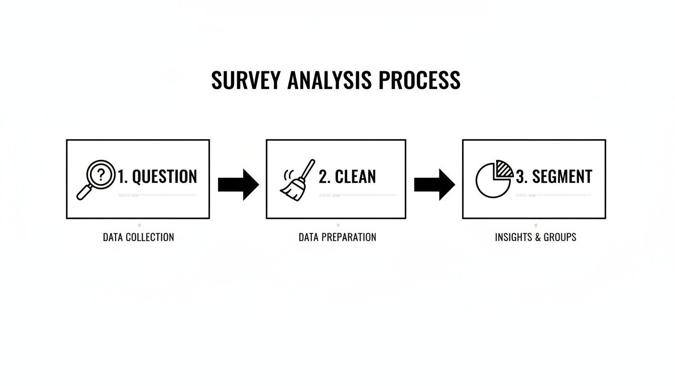
These three steps—defining your question, cleaning your inputs, and segmenting the results—are non-negotiable. Skipping any of them is the fastest way to get misleading results.
Here's a high-level look at the core workflow. This table breaks down each stage, its primary goal, and the kinds of tools people typically use.
| Stage | Primary Goal | Common Tools |
|---|---|---|
| 1. Planning & Design | Define a clear research question and ensure the survey collects the right data. | Google Docs, Miro, Airtable |
| 2. Data Cleaning & Prep | Remove errors, inconsistencies, and low-quality responses for reliable analysis. | Microsoft Excel, Google Sheets, Python (Pandas) |
| 3. Quantitative Analysis | Identify statistical patterns, trends, and relationships in numerical data. | SPSS, R, Tableau |
| 4. Qualitative Analysis | Extract themes and sentiment from open-ended text responses. | Dovetail, NVivo, Manual Coding |
| 5. Insight Synthesis & Reporting | Combine all findings into a clear narrative that drives a business decision. | Microsoft PowerPoint, Google Slides, Canva |
Moving through these stages methodically is what separates a pile of raw data from a report that actually sparks change.
1. Start By Defining Your One Big Question
Most survey analysis projects are dead on arrival. It’s not about stats or pivot tables. The real killer is a lack of focus. Founders need answers that lead to decisions, not a pile of "interesting" data points that go nowhere.
Before you touch a spreadsheet, nail down the one core business question you're trying to answer. This isn't a fuzzy goal like "improve the user experience." It needs to be sharp, specific, and tied to a decision.
A weak question gets you a weak analysis. A strong question acts as a filter, telling you what matters and what's noise.
- Weak Question: What do users think of our onboarding?
- Strong Question: Which specific step in our onboarding process causes the most friction for first-time users, leading them to abandon setup?
See the difference? The second question gives you a target. It tells you exactly how to run the analysis: segment users by completion status and hunt for patterns.
Real Example: I worked with a SaaS company battling high churn in the first 30 days. Their "one big question" was perfect: Is churn caused by a missing feature or a confusing user interface? They hypothesized it was a missing feature and were ready to build. But after segmenting feedback from churned users, the data showed 73% of responses included phrases like "couldn't find X." It was the UI. That insight saved them an entire quarter of wasted engineering effort.
Actionable Takeaway: If your question doesn't point directly to a business decision, rewrite it. Your analysis is only as good as the question you ask.
2. The Necessary Mess of Data Cleaning
Raw survey data is never clean. It's a jumble of half-finished thoughts, typos, duplicates, and bots. Analyzing this mess as-is is a recipe for disaster. This part isn’t glamorous, but it’s non-negotiable.
Here’s your checklist to bring order to the chaos.
- Zap Duplicates: Easiest win. Delete identical submissions.
- Handle Missing Data: If someone only answered 2 out of 10 questions, their submission is worthless. I set a threshold—if a response is less than 75% complete, it’s out. Be consistent.
- Standardize Everything: Your survey tool sees 'USA', 'U.S.A.', and 'United States' as three different places. You have to consolidate them into one format.
- Split Your Data: Create two files right away. One for quantitative data (NPS, ratings) and another for qualitative, open-text responses. You analyze them differently.
Real Example: An e-commerce brand's post-purchase survey was a classic mess. The "How did you hear about us?" column had "ig," "Instagram," and "insta." We recoded them all to a single, clean value: "Instagram." We standardized all location data to proper state abbreviations. Rows where a customer only gave their name? Deleted. Suddenly, the dataset was reliable.
Actionable Takeaway: Spend the first 20% of your analysis time just cleaning. This investment will prevent the other 80% from being wasted on chasing false leads in bad data.
3. Find the Story Hidden in Your Numbers
With clean data, the hunt begins. This is where you stop looking at rows and start looking for a story that drives a decision.
Most people stop at descriptive stats—calculating an average NPS and calling it a day. But averages hide the truth. They flatten the peaks and valleys where your real problems and opportunities live.
The magic is in cross-tabulation. It sounds technical, but it’s just segmenting your data to compare how different groups answered.
Stop asking, "What's our overall satisfaction score?" It's lazy. Ask better questions:
- How do NPS scores compare between customers on our 'Pro' plan versus our 'Basic' plan?
- Do users who signed up three months ago rate support differently than three-year veterans?
This moves you from a single, misleading number to a nuanced narrative.
Real Example: A B2B SaaS company was stuck with a mediocre 3.5/5 CSAT score. They had no idea where to start. We cross-tabulated their CSAT scores against user roles. The story became crystal clear.
| User Role | Average CSAT Score |
|---|---|
| Admins | 4.6 / 5 |
| Managers | 4.2 / 5 |
| Analysts | 2.1 / 5 |
The problem wasn't the whole product; it was the Analyst user experience. We dove into their comments and found they all struggled with a clunky reporting feature that Admins and Managers never touched. That one cross-tab transformed a vague problem ("our CSAT is mediocre") into a specific, solvable one ("fix the reporting module for Analysts").
Actionable Takeaway: The most valuable insights don't live in the averages; they live in the differences between customer segments. If you're not segmenting, you're not analyzing.
4. Decode the "Why" in Your Qualitative Feedback
Numbers tell you what is happening. Open-ended text tells you why. This is where most people drown in a spreadsheet of raw customer opinions. It's a goldmine, but it's messy.
You have to quantify the qualitative. Turn individual voices into numbers you can track. You have two paths: manual coding or AI analysis.
- Manual Coding: Read every response and assign thematic codes ('pricing issue,' 'bug report'). Tally them up. It's effective for small datasets (<50 responses) but a soul-crushing time sink for anything larger.
- AI-Powered Analysis: Use software to do the heavy lifting. Tools using Natural Language Processing (NLP) basics can categorize feedback, detect sentiment, and identify emerging topics in minutes.
Here’s how they stack up.
Manual vs AI-Powered Qualitative Analysis
| Attribute | Manual Coding | AI Analysis (NLP) |
|---|---|---|
| Speed | Painfully slow. | Incredibly fast. |
| Scalability | Poor. Breaks after ~100 responses. | Excellent. Scales to millions. |
| Objectivity | High risk of researcher bias. | Highly objective and repeatable. |
| Cost | High labor cost (time is money). | Lower than labor costs at scale. |
Real Example: A mobile app company was drowning in thousands of app store reviews. They fed 5,000 reviews into an AI analysis tool. The result was a single, undeniable insight: the theme 'slow loading time' was mentioned 3x more often than any other complaint. This wasn't a hunch; it was a quantified fact. 'Performance optimization' immediately shot to the top of their backlog.
Actionable Takeaway: If you have more than 50 open-ended responses, stop reading them one-by-one. Use a tool to quantify the themes and find your biggest leverage points in minutes, not days.
5. Create a Report That Forces a Decision
All the analysis in the world means nothing if it doesn't lead to a decision. Your final job is to tell a story so compelling that leadership can't ignore it.
Forget 50-page slide decks. Your goal is a tight, one-page report built to get a clear 'yes' or 'no'.
The One-Page Action Report Framework
- The Key Insight: Start with the single most important thing you discovered. One crystal-clear sentence.
- The Supporting Evidence: Back it up with the two or three most powerful charts or data points. These are the "receipts."
- The Recommendation: Propose a single, specific, actionable next step. Give them something to approve or deny.
This isn't just showing data; it’s building an argument that makes your recommendation feel like the only logical path forward.
Real Example: A SaaS company was bleeding enterprise clients. Leadership was convinced it was pricing. The one-page survey report told a different story:
- Key Insight: Our enterprise customers are churning due to a lack of critical integrations, not price.
- Supporting Evidence:
- Chart: Churn rate for accounts without a Salesforce integration was 65% higher.
- Table: "Salesforce" and "integration" were the top two keywords among churned accounts.
- Recommendation: Pause new feature development to prioritize building a native Salesforce integration in Q3.
The "lower our price" conversation died on the spot. The recommendation was approved in under 24 hours. That’s the power of a report built for action. You can see this structure in more detail with this example of a survey report.
Actionable Takeaway: Your job isn't done until you've translated your analysis into a concrete recommendation that someone can say 'yes' or 'no' to. If your report ends with 'further research is needed,' you've failed.
Frequently Asked Questions About Analyzing Survey Data
What is the first step in analyzing survey data?
Define your primary research question. Before you look at a single response, you must know what specific business decision the analysis is meant to drive. This focus prevents you from getting lost in useless data points.
How do you analyze open-ended survey questions?
The goal is to quantify qualitative feedback. Manually read and group responses into recurring themes (e.g., 'pricing concerns', 'bug reports'). Then, tally the counts for each theme. For larger datasets, AI tools automate this categorization to save a massive amount of time and reduce bias.
What are the 3 methods of survey analysis?
The three core methods are:
- Descriptive Statistics: Summarizing the basics (e.g., averages, percentages). It gives a high-level view but often hides the real story.
- Cross-Tabulation (Segmentation): Comparing responses across different user groups (e.g., new vs. old customers). This is where you find the most actionable insights.
- Qualitative Coding: Systematically categorizing open-ended text comments into themes to quantify customer feedback.
What software is best for analyzing survey data?
It depends on the job. For simple analysis, Google Sheets or Excel work fine. For advanced statistical tests, you'll need tools like SPSS or R. For analyzing large volumes of open-text feedback, AI platforms are purpose-built to automate the process and find insights fast.
If you've got more than 20 open-ended responses, stop suffering—Backsy.ai scores them in minutes.