Your UX Research Report Is a Paperweight. Here's a Template That Isn't.
Ditch the slide decks nobody reads. Use this battle-tested UX research report template to turn raw findings into decisions that drive product growth.
Posted by
Related reading
What Is Product Validation? (And How to Stop Building Things Nobody Wants)
What is product validation? Learn the battle-tested process for proving market demand, avoiding costly failures, and building products people actually want.
Sentiment Analysis Isn’t a “Nice-to-Have”. It’s a Lie Detector for Your Product.
Founders love chasing features, but customers speak in emotions. Learn what sentiment analysis really is, how it works, and how it reveals the truth behind your feedback. No fluff.
How to Collect Anonymous User Feedback (With Ready-to-Use Form Example)
Learn how to collect anonymous user feedback with higher honesty and lower bias. Includes examples, templates, and a ready-to-use feedback form you can embed instantly.
Let's be blunt. That 50-page UX report you spent three weeks perfecting? Nobody read past the executive summary. If you were lucky. And if they did, they forgot it by lunch. You didn't produce an "insightful document"; you created a glorified paperweight that gives everyone the illusion of progress while the product slowly dies.
In a startup, a research report has one job: force a decision. That’s it. Anything else is academic theater, and your runway is too short for that noise.
Your 'Comprehensive' Report Is a Glorified Paperweight
Ignore your customers, and you’ll be lucky to survive the quarter. Bury their feedback in a 50-page report, and you’re just doing the ignoring for everyone else.

I learned this the hard way. We almost killed a killer feature because a single, game-changing insight was buried on slide 27 of a report nobody had time to read. The designer saw it. The PM skimmed the summary. The engineer never even opened the file. The critical piece of evidence was lost in the noise we created.
Your job isn't to "inform." It's to "instigate." Did your report kill a bad idea? Did it greenlight a pivot? Did it force a C-level exec to finally feel the user’s pain? No? Then it failed.
Today's product cycles are moving too fast for the old ways. GenAI is reshaping the product development industry, and teams need insights that plug directly into the next sprint, not a novel to read over the weekend. Forget impressing stakeholders with rigor. Your only job is to deliver a punch to the gut that sparks action. Your report isn’t a document; it’s a weapon.
Takeaway: A report’s value isn't measured in pages, but in the decisiveness it creates.
How to Structure a Report That Gets Read
Forget the idea of a "document." You're building a strategic dossier—a weapon engineered for one purpose: to drive a decision. Anything that doesn't push a stakeholder toward a clear "yes" or "no" is waste. Cut it.
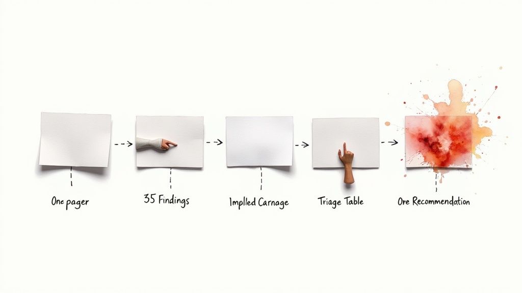
An effective UX research report has five parts. Not six.
This structure is for the sleep-deprived CEO who has 90 seconds between meetings. It’s for the engineer who needs to know what to build, not how you sourced your participants.
1. The No-BS Executive Summary
This isn't a summary. It's the entire story on one page. It’s the only thing most people will read. It must stand alone. Deliver the single biggest problem, the tangible cost of ignoring it, and your one, unambiguous recommendation. No preamble. No methodology. Just the verdict.
2. 3-5 Bombshell Findings
These aren't gentle "observations." They are undeniable truths backed by raw, visceral evidence.
- Finding: "Users can't find the checkout button."
- Evidence: A 30-second clip of a user rage-clicking the wrong UI, muttering, "Where the hell is it?"
- Finding: "Our onboarding makes new users feel incompetent."
- Evidence: The direct quote: "I have a master's degree and I can't figure this out. I must be an idiot."
Your goal isn't to be liked; it's to be understood. Raw user clips and direct quotes are your ammunition. Use them.
3. The Implied Carnage
Connect each finding to the only thing the business truly cares about: the bottom line. Data without a dollar sign is a hobby.
- Finding: "Users abandon cart when asked for their phone number."
- Implied Carnage: "This friction point is costing us an estimated $15,000 in monthly recurring revenue, based on our 42% abandonment rate at this step."
Suddenly, it’s not a UX problem. It’s a revenue problem. Now you have their attention.
4. The Report Triage Table
This is where you force a decision. A brutally honest prioritization framework that separates critical fixes from trivial noise. You can't fix everything, so what are you willing to let burn?
| Finding | What Happens If We Ignore This (The Carnage) | Effort to Fix (1-5) | Decision |
|---|---|---|---|
| Onboarding Confusion | New user churn increases by 20% in the first 7 days | 2 | Fix Now or Die |
| Vague Button Labels | Support tickets for "how-to" questions increase 35% | 1 | Fix Next Sprint |
| Outdated Logo | Zero measurable impact on user behavior or revenue | 5 | Ignore |
This isn’t a suggestion box; it’s a strategic tool for allocating scarce resources.
5. The One Recommendation
End with a single, opinionated, and unambiguous path forward. Don't hedge. Don't offer a menu of options—that's just passing the buck. Your job was to figure it out. Give the team one clear directive that eliminates debate and focuses all energy on the most critical action. You can present this final step with interactive content platforms to make it even more pointed.
Takeaway: Your report is a weapon to force a decision, not a document for discussion.
Stop Presenting Data. Start Telling a Story.
Raw data is boring. Spreadsheets are forgettable. Your job isn't to be a court stenographer, rattling off user quotes. You're a storyteller. Your user is the hero, product friction is the villain, and the moral of the story is the change your team must make.

Numbers don't move people. Stories do.
Frame for Impact
Don't say, "7 out of 10 users clicked the wrong button." That's an academic observation.
Frame it with urgency: "We're making 70% of our new users feel stupid in their first five minutes."
One is a statistic; the other is an accusation. One invites a nod; the other demands a response. Translate cold data into emotional impact. Make stakeholders feel the user’s pain so acutely that doing nothing feels irresponsible. This is how you create actionable insights from data.
A user sighing in frustration is a thousand times more powerful than a bar chart showing low engagement. Capture it, frame it, and put it on slide one.
Build an Emotional Arsenal
Your report is a container for emotional ammunition.
- Annotated Screenshots: Don't just show the screen. Circle the confusing button, add a massive question mark, and slap the user’s quote next to it: "What am I even supposed to do here?"
- Rage-Click Heatmaps: Frame it as, "This is where our product fights the user—and wins."
- Cringe-Worthy Quotes: Dig up the most damning, brutally honest quotes. The ones that make your PM physically wince are the ones that drive change.
Mastering the principles of visual storytelling isn't optional; it's how you make your point undeniable.
Takeaway: Data informs, but emotion compels action.
Democratize the Intel, Not the Process
"Data-driven" doesn't mean emailing raw interview transcripts to the whole company. That's not democratization—it’s chaos. It guarantees a designer, a PM, and a marketer will all walk away with three different, self-serving interpretations.
Your job is to own the synthesis. You provide the "so what?" Handing your team raw notes is like giving them a pile of lumber and expecting a house. It's not just lazy; it’s irresponsible. Others are learning this the hard way, as you can see in this detailed report on research democratization.
Build an Arsenal, Not an Archive
Stop creating reports that die in a forgotten Google Drive folder. You need an "Insight Repository"—a living arsenal of findings that are tagged, searchable, and ruthlessly curated.
- The Finding: “Users don’t trust our pricing page.”
- The Evidence: A 15-second clip of a user saying, “This feels scammy.”
- The Impact: “Contributes to a 30% drop-off before checkout.”
This is how you arm your colleagues with proven insights they can use immediately. It's a critical part of any strategy for how to get customer feedback and turn it into fuel.
Democratization means everyone gets the finished bullet, not the raw gunpowder. Your job is to manufacture the ammunition.
Control the Narrative
New rule: nobody gets raw interview transcripts. They get the synthesized, evidence-backed finding with a deep link to the exact moment in the recording where that insight came from. This scales knowledge without scaling confusion. You're not a librarian; you're the head of intelligence, delivering actionable briefs to the front lines.
Takeaway: Share conclusions backed by evidence, not raw data that invites misinterpretation.
The Presentation Is the Product
Your research is worthless until it changes someone's mind. The ux research report template is just an artifact. The real product is the presentation. Firing off a PDF is surrender. You have to force the conversation.
Get the key decision-makers in a room for a live, mandatory, 30-minute meeting. Not optional. This is a session to secure a decision, not to "share findings."

The 30-Minute Playbook
- Minutes 0-5: Make Them Feel the Pain. Start with your most visceral piece of evidence. A 30-second video of a user groaning. Make them feel the problem before you explain it.
- Minutes 5-20: Drop the Bombshells. Your 3-5 critical findings, each backed by undeniable video proof or a gut-punch quote. Frame each one as a direct threat to a business goal.
- Minutes 20-25: Show the Financial Cost. Translate user pain into dollars. "This confusion isn't a UX issue; it's costing us $40,000 a month in churn." Put a price tag on inaction.
- Minutes 25-30: Give Them Your One Recommendation. End with one clear path forward. No menus. No debate. Make it incredibly easy for them to just say "yes."
This structure corners stakeholders into making a call.
Handling the Rogues' Gallery
Your presentation needs to be bulletproof against the usual suspects.
- The Skeptical CFO: Only speaks ROI. When they ask about the cost of your fix, you hit them with the "cost of inaction" you just presented. It’s a choice between a smart investment and a guaranteed loss.
- The Optimistic PM: Thinks users will "figure it out." Your raw video clips are their kryptonite. When they posture, play the clip of the user literally giving up.
- The Overburdened Engineer: Hears every new idea as more technical debt. Your "One Recommendation" must be specific and tightly scoped. "Change the label on this one button. That’s it."
The goal isn’t to open a discussion; it’s to secure a decision. You walk out with a ‘yes’ or ‘no,’ not a ‘let’s circle back.’
Takeaway: Stop sending reports and start forcing decisions with a high-stakes, 30-minute presentation.
Your Burning Questions Answered
Alright, let's cut through the typical objections.
How do I handle stakeholders who demand more data?
It's a test of your conviction. Frame your response like this: "The core findings and strategic recommendation are all here. For anyone who wants the full 100-page dossier with the methodology and raw data, here’s a link. I've designed this summary to respect your time."
99% of them will never click it. They don't want more data; they want the comfort of knowing it exists. You call their bluff professionally and move on.
What if my findings are inconclusive?
Then say that. Clearly. An inconclusive result is a result. It means you just saved the company from building the wrong thing based on a flimsy assumption. Your "One Recommendation" is to run a more targeted experiment or kill the initiative. Your report's headline becomes: "Our Hypothesis Was Wrong, And Here's Why That's Great News." Honesty builds more trust than a forced conclusion ever will.
Isn't this approach too aggressive for building consensus?
Consensus is what slow companies chase. High-growth teams need conviction and velocity. The time for consensus is before the research starts, when you align on the critical business questions. This report isn't a new debate; it's the verdict based on the evidence you all agreed to gather.
Takeaway: Your report is the verdict, not the start of a new trial.
Stop building reports that get ignored and start creating weapons that force decisions—get the raw, unfiltered customer voice you need to load them from Backsy.