Your Survey Data Is a Goldmine of Polite Lies
A founder's guide to analyse survey data. Learn to cut through noise, find real insights, and make decisions that actually grow your business.
Posted by
Related reading
Transforming Customer Feedback Analysis with AI in Real-Time
Discover how AI revolutionizes customer feedback collection and analysis, enabling swift, informed decision-making for businesses.
10 Voice of Customer Examples You Can Actually Use
Stop guessing. See 10 real voice of customer examples from surveys, social media, and support tickets to find out what your customers actually want.
A Founder's Guide to Analyzing Survey Data
A battle-tested approach to analyzing survey data. Learn how to turn raw feedback into actionable insights that drive real business decisions.
Let's be honest. You just ran a survey, you're sitting on a pile of data, and you feel productive because you "listened to your customers." You're probably just looking for a high-five, not the hard truth.
Ignoring customers is a fast-track to bankruptcy. But listening to the wrong feedback? That's even more dangerous. You’ll end up building the perfect product for ghosts.
Most founders use surveys to stroke their own ego. They launch a feature, ask "How much do you love this?" and then screenshot the 5-star reviews for their next board meeting. That isn't data analysis. It’s performance art.
This isn't another HubSpot guide. This is an intervention. I'm going to show you how to analyse survey data to find the brutal truths that actually build a business, not just a slide deck.
Takeaway: Your survey is worthless until you treat every response like a lie.
Step 1: Define the One Question That Actually Matters
Before you write a single survey question, ask yourself: "What one decision will I make with this data?"
If you don't have an answer, stop. You're just creating busywork. A "win" isn't "getting feedback." A win is getting a statistically significant answer to a high-stakes question that forces you to act.
Think of it like a bet. "If 70% of churned users say 'missing feature X' was the reason, we dedicate the next sprint to building it. If less than 20% say that, we kill the feature from the roadmap forever."
If you can’t map every plausible outcome to a concrete, painful decision, the question is worthless. You're just satisfying your curiosity, not running a business. Most founders are too afraid to do this. They want wiggle room. A good survey is meant to eliminate options and light up a clear path forward.
And for God's sake, stop asking "all users." That's like shouting for directions in a crowded mall.
- To reduce churn? Ask people who cancelled in the last 30 days. Their pain is fresh.
- Building an enterprise feature? The opinions of your free-tier users are actively harmful.
- Improving onboarding? Survey users who signed up 7-14 days ago. Not day one, not day 90.
Anything else is just noise. Your job is to find the signal.
This process isn't about being nice. It's about being effective. Asking the wrong people the wrong questions is founder malpractice. You need effective survey questions about a product, not a vanity poll. You need to understand how to gather customer feedback that actually drives growth, not just collects dust.
Takeaway: If the answer can't change your roadmap, kill the question.
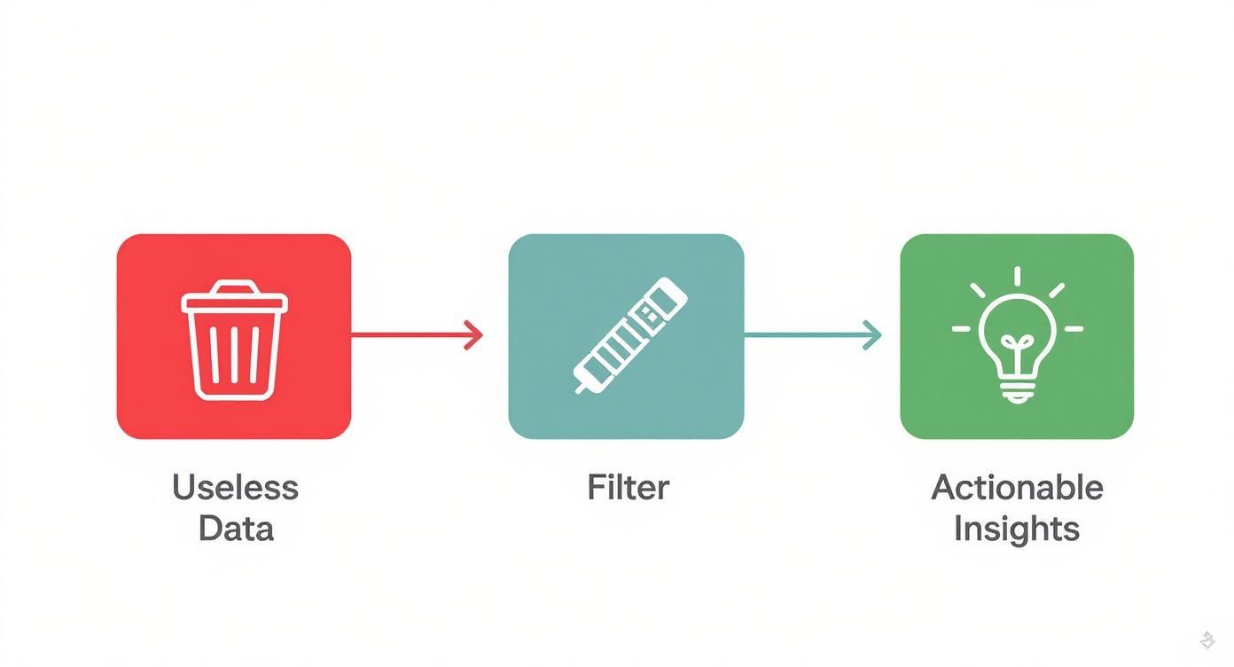
Step 2: Burn 30% of Your Data (The Fun Part)
Your raw survey export is a toxic swamp. It’s filled with bots, speed-demons clicking random answers, and people who aren't your customer. Thinking you can just download the CSV and start making charts is how you steer your company straight into a wall.
This is the janitorial work that separates winners from wantrepreneurs. Be prepared to throw away 20-30% of your responses. If that number makes you flinch, you're too attached. Bad data is a liability that will poison your decisions.
Hunt down the usual suspects and delete them without mercy:
- The Speed Demons: They answered 50 questions in 30 seconds. They didn't even read them. Delete.
- The Straight-Liners: They answered '5' for every single question. They're lazy. Delete.
- The Gibberish-Tippers: Their open-ended feedback is "good" or "asdfghjkl." They're bots or they're bored. Delete.
Applying essential data cleansing techniques isn't optional. It’s your first line of defense against building a product nobody wants.
Next, filter for who actually matters. Not all real feedback is relevant. If you're building a tool for enterprise software teams, the feedback from a freelance wedding photographer who stumbled upon your site is worse than useless—it's a distraction. Use the demographic questions you asked to filter down to your Ideal Customer Profile.
Takeaway: Your raw data is a liability, not an asset, until you’ve meticulously cleaned it.
Step 3: Stop Looking at the Average
Your overall NPS score is a vanity metric. A single number like "NPS is 42" tells you nothing. It's a flat, lifeless snapshot. The real story, the actionable truth, is in the delta—the gap between how different groups of customers feel.
The most lethal insights are buried in simple segmentation.

This is where you stop looking at data and start interrogating it. A spreadsheet is your weapon. Slice your data along the natural fault lines of your business:
- By Pricing Tier: Are your Enterprise customers (the ones paying thousands) less happy than your free users? That's a five-alarm fire.
- By User Cohort: Are your oldest, most loyal users suddenly becoming detractors? That's a massive red flag that you've broken something they loved.
- By Engagement Level: Do your power users and casual users ask for the same things? If not, you have a major decision to make: deepen the product for the pros or simplify it for the masses.
Years ago, our overall NPS was a respectable 35. Then we segmented by user role. The "End User" NPS was a healthy 55. But our "Admin" NPS was -20. A dumpster fire. The admins were the ones signing the checks, and they were invisible in the average. That one simple segmentation exercise saved the company.
Takeaway: The average is a lie; the most profitable truths are in the extremes.
Step 4: Quantify the Feelings
Now for the open-ended text. The numbers tell you what, but the words tell you why.
Most founders scroll through the comments, cherry-pick three that confirm their bias, and call it a day. That's malpractice. Your job is to turn that wall of text into a prioritized roadmap.
Forget word clouds. They're the PowerPoint clip art of data analysis. We're going to quantify the qualitative by tagging and counting.
Here's the system. It's tedious but non-negotiable.
- Read the first 50 responses. Just get the vibe.
- Create broad tags in a spreadsheet:
Bug Report,Feature Request,Pricing Complaint,UI/UX. - Go through every single response. Apply one or more tags. Be disciplined.
- Count the tags.
This is how you go from "People are unhappy" (useless) to "27% of churned users mentioned 'confusing navigation'" (a fire alarm). This is how to analyze qualitative data like someone who has payroll to meet.
Once you have more than a few hundred responses, doing this manually is a waste of your time. Your brain is great for nuance, but an AI tool like Backsy is built for scale. Use your intuition to set the direction, then let the machine do the grunt work.
Takeaway: Reading comments for "the vibe" is a waste of time; if you aren't counting themes, you aren't analyzing.
Step 5: Make a Report That Forces a Decision
That 50-slide deck you spent a week on? Nobody is going to read it. Stop performing "analysis theater" and start driving action.
The only report that matters is a one-page summary. This constraint forces you to be brutal. It should have three sections, and that's it.

- What We Learned (Max 3 Bullets): No fluff. "25% of enterprise users are at risk of churn due to slow report generation." Be specific. Quantify it.
- What We're Going to Do: "The engineering team will dedicate the next sprint to building a caching solution for reports." Assign an owner and a deadline.
- What We're Explicitly Not Going to Do: This is the most important part. "We are deprioritizing all requests for 'dark mode' to focus on this." This kills scope creep and forces strategic trade-offs.
Your charts should be simple enough for a skeptical engineer to understand in five seconds. No 3D pie charts. Just dead-simple bar charts that show a painful comparison. For more on this, read up on data visualization best practices.
This document is a contract with your team. It's a public declaration of the bets you’re making.
Takeaway: A report that doesn't force a decision is just expensive wallpaper.
Stop building reports nobody reads and let Backsy turn your customer feedback into a prioritized action plan automatically.