Your Customer Experience Dashboard Is Lying To Your Face
Stop trusting vanity metrics. Build a customer experience dashboard that reveals hard truths about churn, retention, and revenue. A founder's guide.
Posted by
Related reading
Why Reputation Management Tools Matter More in 2025 Than Ever
Learn how reputation management tools help businesses track reviews, analyze feedback, and protect brand image. A modern guide with AI-driven insights using Backsy.
Sentiment Analysis Isn’t a “Nice-to-Have”. It’s a Lie Detector for Your Product.
Founders love chasing features, but customers speak in emotions. Learn what sentiment analysis really is, how it works, and how it reveals the truth behind your feedback. No fluff.
Customer Retention Metrics: The No-BS Guide for Founders
Stop guessing. Learn the essential customer retention metric formulas and strategies to turn your data into predictable, long-term business growth.
Let's be honest. Your company dashboard is probably a trophy case. You glance at it, see a bunch of green numbers, and get a warm fuzzy feeling while your business is silently bleeding out in the support queue.
I learned this the hard way. We launched a new feature. Initial CSAT scores were glowing. Engagement charts went up and to the right. We were high-fiving in Slack, admiring the smoke while completely missing the fire. What our pretty charts conveniently hid was the 15% spike in support tickets from confused users and the silent churn bomb set to detonate three months later.
We were sedating ourselves with good news while the patient was flatlining. A good customer experience dashboard isn’t a report card you hang on the wall. It’s a real-time battle map that shows you exactly where you're getting shelled. Its main job is to detect pain, not make you feel good.
Takeaway: If your dashboard is all green, it’s not a tool; it's a vanity project.
Stop Admiring Problems and Start Fixing Them

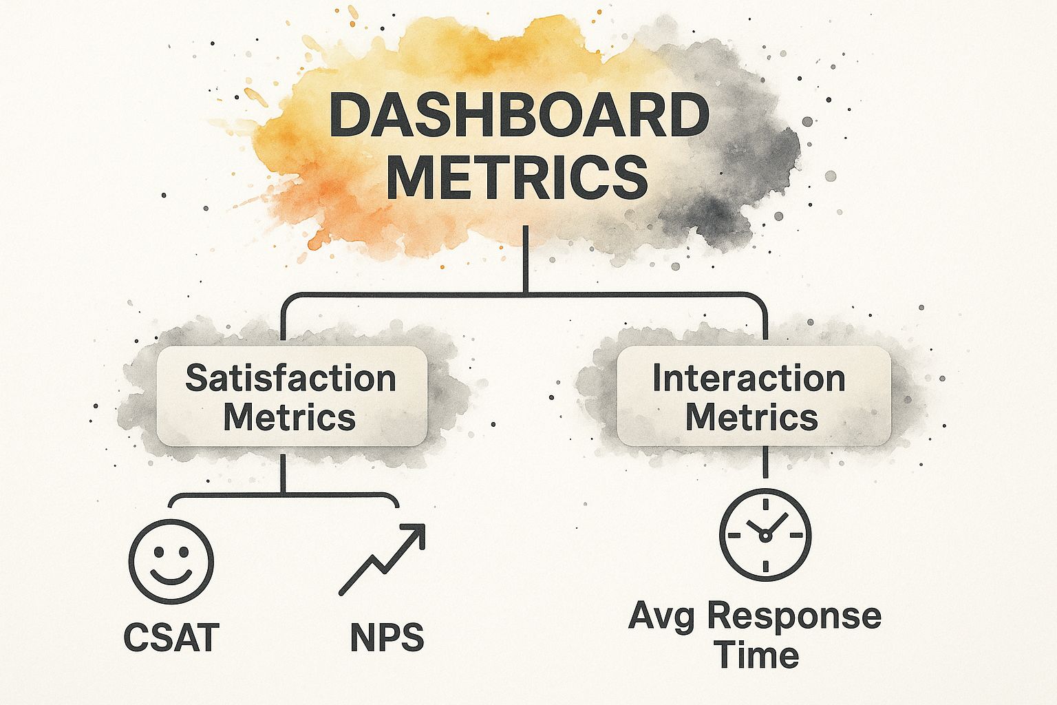
Most founders are addicted to lagging indicators. You’re staring at your Net Promoter Score (NPS) and Customer Satisfaction (CSAT) scores, feeling pretty smart. Stop. Those are autopsy reports. They tell you what went wrong after the customer is already dead and gone.
Ignore what your customers are doing, and you’ll be lucky to survive the quarter.
You need to track what predicts the future, not what reports on the past. This isn't complicated. It boils down to three pillars: Product Engagement, Support Load, and Financial Health. Everything else is mostly noise.
Pillar 1: Product Engagement (Are they actually using it?)
Forget "daily active users." A user logging in and doing nothing is a liability waiting to churn. Track metrics that prove they're getting value.
- Core Action Completion Rate: What's the one thing a user must do to get value? Send an invoice? Run a report? Track the percentage of users who actually complete that task. If this is low, your product is a ghost town.
- Time-to-Value (TTV): How long does it take a new user to complete that core action for the first time? If it takes three weeks, they’re gone. Your job is to shrink this from days to minutes.
These numbers are brutal, honest feedback on whether your product solves the problem it’s supposed to. They don't care about your feelings.
Pillar 2: Support Load (Your canary in the coal mine)
Your support queue is your earliest warning system. If something is broken in your product, pricing, or messaging, it shows up here first. Stop obsessing over "average response time." Responding quickly to a problem you created is just efficient failure.
Your support team isn't a fire department; they're fire inspectors. Their job is to find the faulty wiring before the whole building burns down.
- First-Contact Resolution Rate (FCR): Can your team solve a problem on the first try? If not, you’re just creating frustrated customers who have to chase you for answers.
- Tickets Per Active User: Is your ticket volume growing faster than your user base? Congratulations, you’re not scaling a business; you’re scaling a crisis.
This turns your support data from a cost-center report into a direct feed for your product roadmap.
Pillar 3: Financial Health (The uncomfortable truth)
Monthly Recurring Revenue (MRR) is for board decks. The numbers that dictate your survival are far more telling.
- Net Revenue Retention (NRR): This is it. The whole game. It tells you how much revenue grows or shrinks from your existing customers. If your NRR is over 100%, you could fire your sales team and still grow. Below 100%? You're pouring new customers into a leaky bucket.
- LTV:CAC Ratio: Customer Lifetime Value divided by Customer Acquisition Cost. A healthy ratio is at least 3:1. Anything less and you have a very expensive hobby, not a sustainable business.
To make sure your dashboard helps you 'fix problems' and not just 'admire them,' it's critical to adopt a rigorous approach to measuring campaign effectiveness by focusing on real business outcomes. You can explore different approaches to this in our detailed guide on https://backsy.ai/blog/customer-satisfaction-measurement-methods.
Takeaway: Stop tracking metrics that make you feel good and start tracking the ones that tell you the truth, especially when it hurts.
Build Your Dashboard This Weekend (No PhD Required)

The biggest lie founders tell themselves is, "We'll build it the right way later." Later is when you're out of business. While you're waiting for perfect, clean data, your competitors are making decisions with their 80%-correct data.
The goal isn't perfection; it's momentum. We're going to stitch this thing together with digital duct tape, and it will be infinitely more valuable than the bloated project your competitor is still debating in committee. Forget hiring a six-figure data engineer. Your mission is to create a single source of truth where problems have nowhere to hide.
The Scrappy Founder's Data Stack
Your data is scattered. Let's pull it together.
- CRM: Where your deals live. (HubSpot, Salesforce)
- Payments: Where the financial truth lives. (Stripe, Chargebee)
- Support: Your early-warning system. (Zendesk, Intercom)
- Product Analytics: What users are actually doing. (Mixpanel, Amplitude)
Looking at these tools separately is like trying to understand a football game by only watching one player. Useless.
Stitching It Together with Duct Tape
You're going to use no-code automation to pipe the most important data into one spot. Don't overthink this.
- Your "Database": A Google Sheet. Seriously. It’s fast, free, and gets the job done now.
- Your Plumber: Zapier or Make. These are your new best friends.
- Your Workflows: Create a few simple automations.
- When a new support ticket is created in Zendesk, add a row in your Google Sheet.
- When a Stripe payment fails, add another row.
- When a user completes onboarding in Mixpanel, add a row.
It's not elegant. But it's brutally effective. In a few hours, you'll have a raw, real-time feed of the most critical events in your business.
Visualizing the Truth
A raw spreadsheet is an eye chart nobody will read. You need charts that scream at you when something is wrong.
Grab a free BI tool like Looker Studio or Metabase. Point it at your Google Sheet. Build a few simple charts for the metrics that matter. Put this dashboard up on a big monitor or make it your browser's homepage. Done. You have a living, breathing customer experience dashboard. It might be ugly, but it tells the truth.
Takeaway: A working dashboard you build this weekend is infinitely better than the perfect one you never launch.
Connect Your Dashboard to Human Beings
A dashboard full of charts is just a pretty screensaver until you connect it to real human stories. Numbers tell you what is happening; customer feedback tells you why.
Seeing a red arrow on a feature adoption chart and calling a "brainstorming" meeting is insane. It's just a group of people guessing. You’re flying blind while your competitor is using a sniper scope. Your dashboard only becomes a weapon when you can click on that red arrow and see the human frustration behind the number.
"Churn rate increased by 2.7%" is a boring problem.
"15 customers, including our third-largest account, churned after complaining about the new invoicing workflow" is a fire everyone will scramble to put out.
From Abstract Data to Urgent Problems
You have to wire your quantitative data directly into your qualitative feedback.
- Link support tickets to user profiles. See a user who hasn't completed a core action? Check their support history. The "why" is probably sitting right there.
- Run targeted in-app surveys. See users abandoning checkout? Hit them with a one-question survey right at that moment: "What's stopping you?" The answers will be brutal and priceless.
- Analyze interview notes. Tag your interview transcripts. See a drop in satisfaction? Filter your notes for tags like "confusing," "slow," or "buggy." You’ll connect the dots in minutes.
The customer experience management (CEM) market is exploding—valued at USD 12.04 billion in 2023 and projected to hit USD 32.87 billion by 2030 (Grandview Research). Why? Because businesses are finally realizing that ignoring the "why" is financial suicide. Connecting these dots used to be a nightmare, but modern customer experience measurement tools can automate it.
When your engineer sees the actual support ticket from a frustrated user next to the bug report, they don't just fix the code. They fix the problem with empathy.
Takeaway: A dashboard without qualitative feedback tells you you’re losing, but it will never tell you how to win.
Four Traps That Will Kill Your Dashboard's Value

So, you built the dashboard. Congratulations. You finished the easy part. Now for the hard part, where 90% of founders drop the ball and turn their powerful new tool into a glorified screensaver.
Trap 1: The Report-Only Dashboard
The dashboard gets pulled up once a week, everyone nods sagely at the charts, and then it’s forgotten. It's a report, not a tool. A dashboard that isn’t woven into your team’s daily rhythm is worthless. Put it on a TV. Start every stand-up with a 60-second review. If a metric is red, finding out why becomes priority one.
Trap 2: Chasing Ghosts
Your Core Action Completion Rate drops by 0.5% on a Wednesday morning, and everyone panics. Stop. You’re chasing ghosts. Not every change is a trend; sometimes, it’s just noise. Wait a day. See if it bounces back. Reacting to every wiggle will burn out your team on meaningless investigations.
Trap 3: Analysis Paralysis
You have so many charts that nobody knows where to start. Momentum dead. Fix this with the "One Metric That Matters" (OMTM) framework. For a month, or a quarter, pick one core metric to improve. Maybe it's reducing TTV. Maybe it's improving FCR. This forces ruthless prioritization. Everything is judged against moving that one number. Learn more about pinpointing what to focus on with our guide on how to get customer feedback.
Trap 4: Correlation vs. Causation Fallacy
You launched a new feature, and signups went up. Champagne! But did you also publish a blog post that hit Hacker News? Did a big influencer mention you? Correlation is not causation. Assuming your action caused the result is lazy thinking. Be the skeptic. Always ask, "What else happened that could have caused this?"
Takeaway: A dashboard is a loaded gun; knowing these traps is the safety you need to keep from shooting your company in the foot.
The Payoff: Why This Pain Is Worth It
Look, this sounds like another project on an overflowing to-do list. You're tempted to stick with gut feelings. That's a fatal mistake. This isn't about adding a task; it's about changing how your company operates. It’s the difference between guessing what customers want and knowing what they need.
A few years back, we saw a tiny 3% increase in failed payments on our dashboard. A statistical blip. But we dug in. We found a subtle bug in our Stripe integration affecting only international customers. Fixing it wasn't just about recovering 3% of revenue; it prevented thousands of happy customers from quietly churning out of frustration.
That single insight was worth more than our entire seed round.
The global market for customer experience analytics was USD 7.82 billion in 2024 and is on track to more than double because the cost of flying blind is now fatal. You can read the full research about these market dynamics to see why your competitors are taking this seriously.
Your dashboard becomes the single source of truth. It settles arguments with data, kills bad ideas before they burn cash, and forces everyone to focus on the only thing that matters: the customer’s reality.
Takeaway: This isn't about building a dashboard; it's about building a business that can't be killed by its own blind spots.
Stop building what you think customers want and let Backsy show you what they're screaming for in their own words. https://backsy.ai